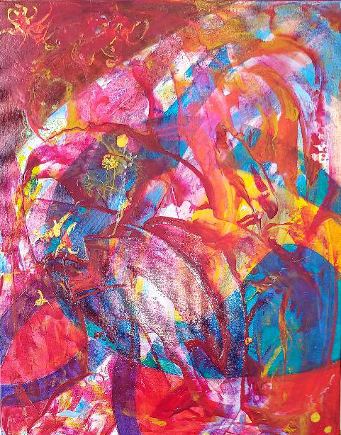
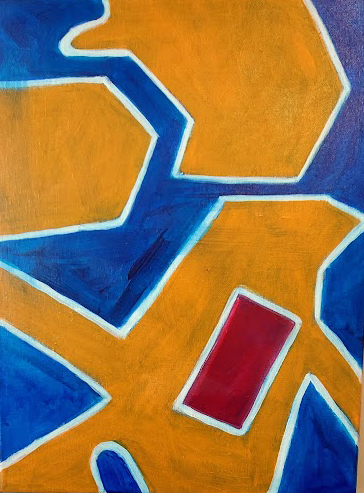
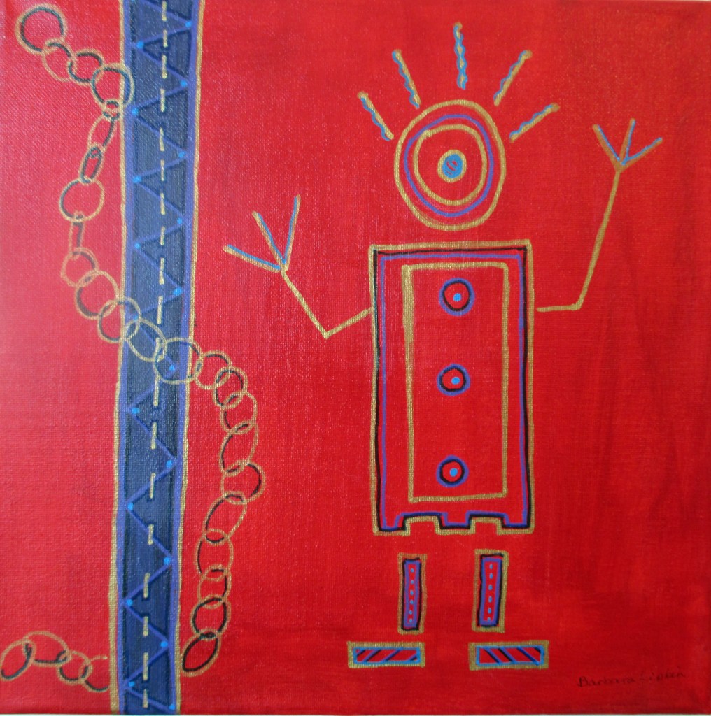
Given the events of the past two weeks, this pretty much expresses my feelings. Even though it represents total chaos, I still think my painting has balance of design and color, so it’s not completely chaotic, not yet anyway. But as for the future, ….?
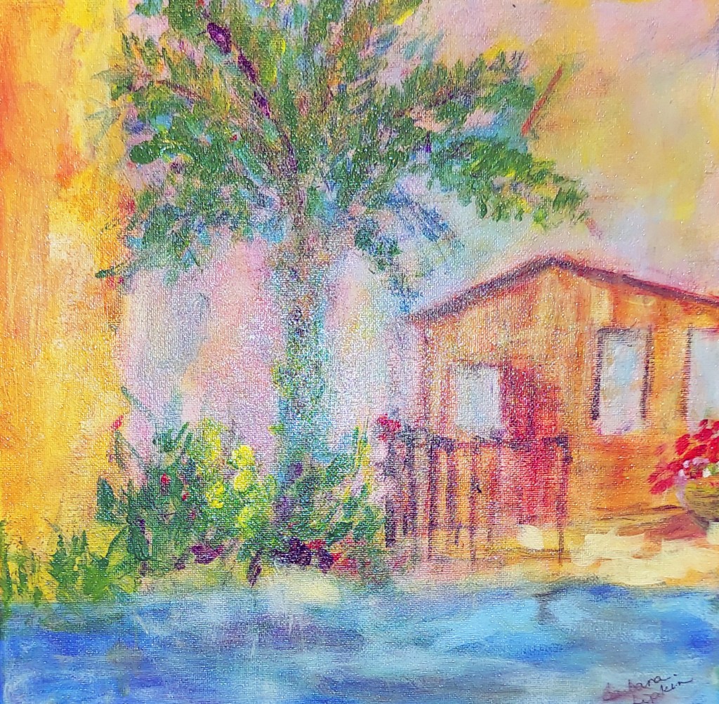
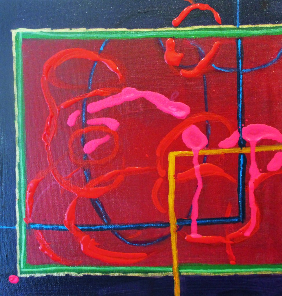
I was tempted to just smear on paint at random, but being an artist, I couldn’t leave it at that, so although this small painting has lots of texture and random marks, I still took the time to judge the need for color complements, focal points, and other compositional elements.
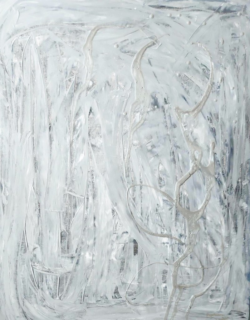
Having gotten the initial impulse out of my system, I’ve just begun another rendition, so I guess the idea of chaos has served me well, in the short term at least, because I broke through my ‘painter’s block’ and am working again, after a hiatus. Feels good. Hope you like the results.