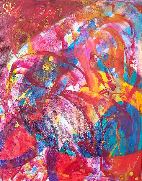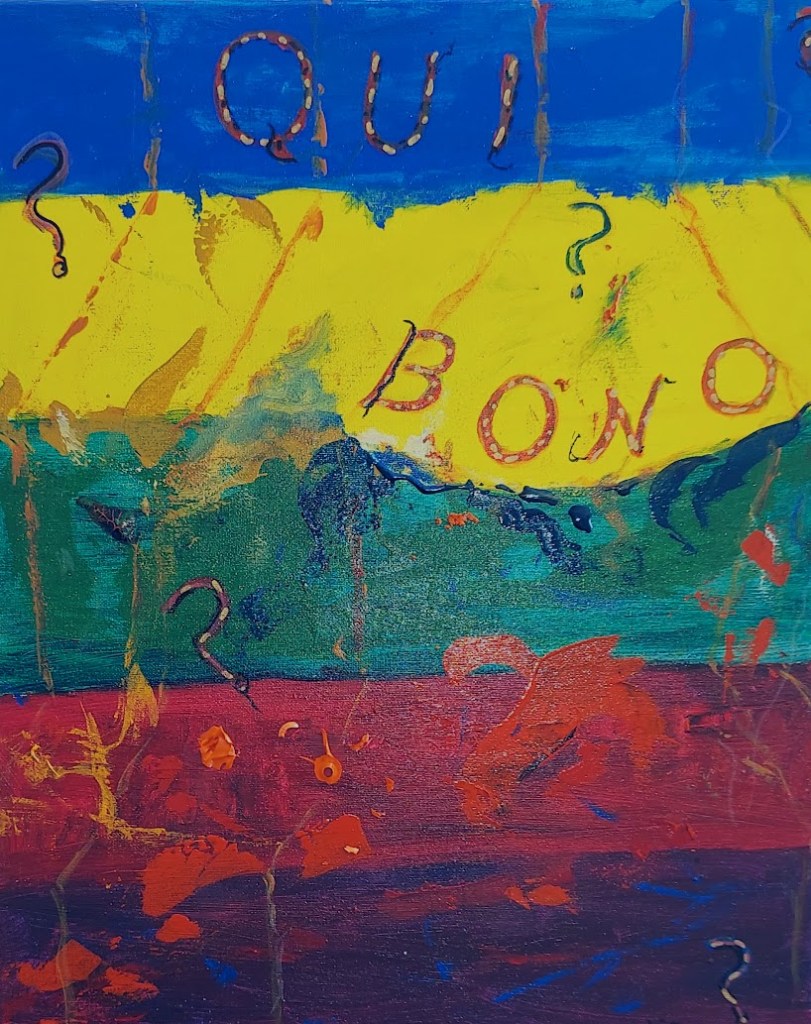
I actually thought of the title for this painting before I began painting it. It came to me while I was reflecting (for a change) on the many disastrous decisions being made at the White House these past 3 months. Qui Bono? Who benefits? Well – certainly nobody I know.
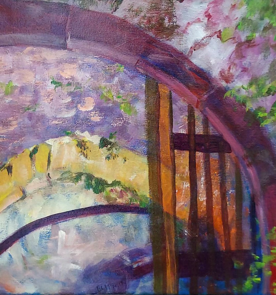
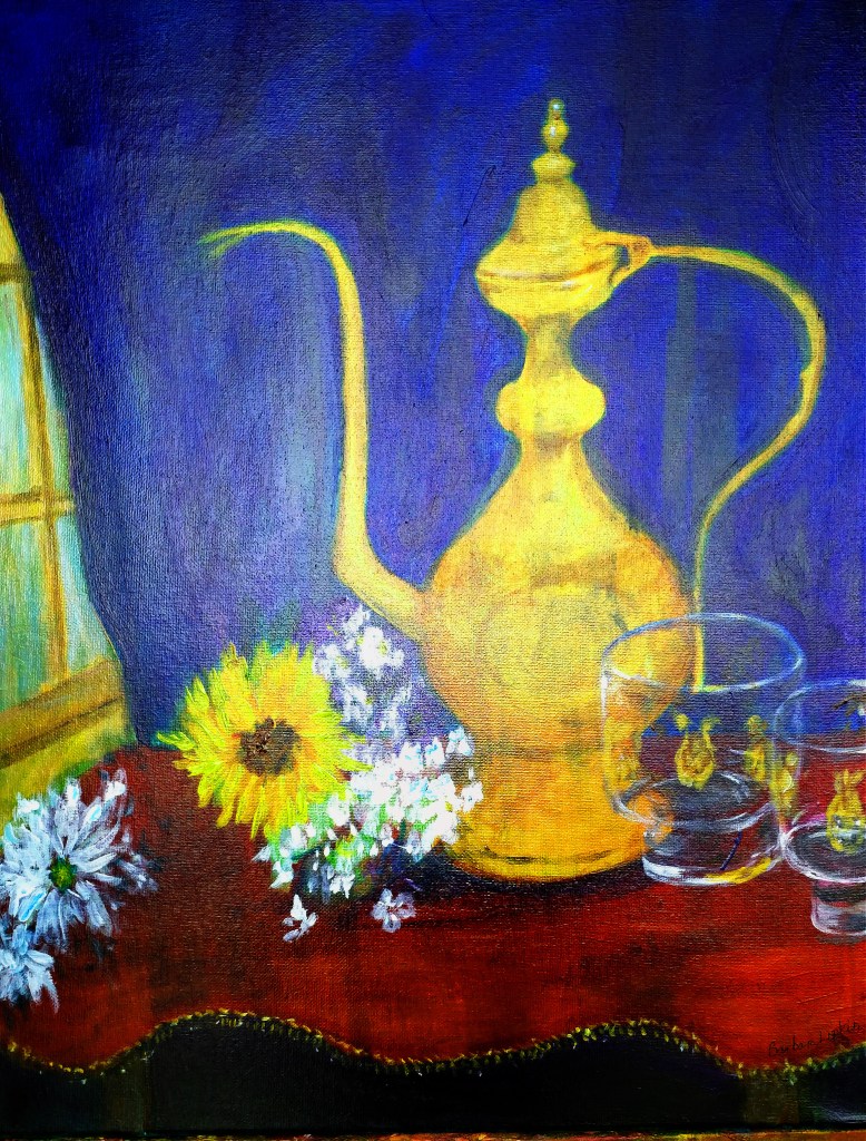
I could paint pretty landscapes or appealing still lifes. Not terribly challenging anymore, but still fun to do. I could do portraits. Somewhat more interesting, but they still don’t fit the bill. But abstracts, yes! Slapping paint on a canvas, red and angry! Free-form, flowing! Yes – that does the job.
Qui bono? I don’t know, but I hope you find my painting interesting to look at and think about.