Love the Caribbean, especially when it’s cold and snowing at home and I’m enjoying the warmth and sunshine and the flora and fauna of a beautiful Caribbean island. Did you ever have a macaw eat out of your hand while iguanas chased each other across the landscape? Heaven!
So–to bring a little taste of that back home, here’s Caribbe! 16 x 20, Acrylic.
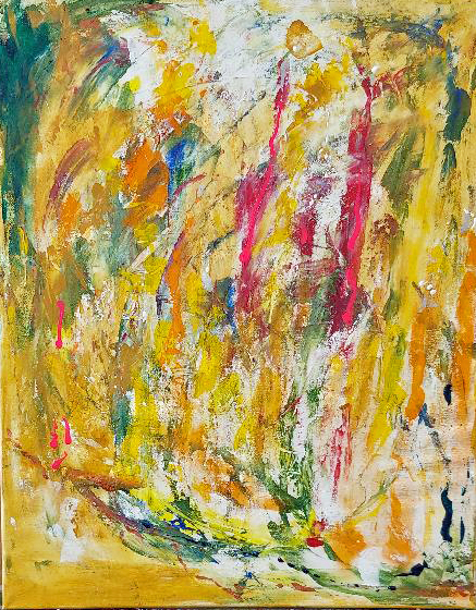
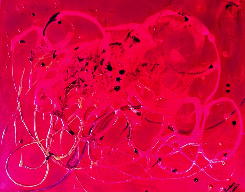
We just recently celebrated the holiday of Chanukah, and one of the songs associated with this holiday is Ocho Kandelikas (Eight Candles), a reference to the number of candles lit during the holiday, one for each of 8 nights. This song is written in Ladino, a Spanish-Hebrew language originally spoken by the Jews of Iberia.
While walking around the studio, humming this song, my paint brushes decided to transform the canvas I was working on into an homage to ocho kandelikas, so here it is. I love creating abstract designs, letting the colors flow, adding highlights where they need to be. Plenty of texture, too, though that doesn’t come through well in the photo. But you can find 8 candles there, if you look carefully.
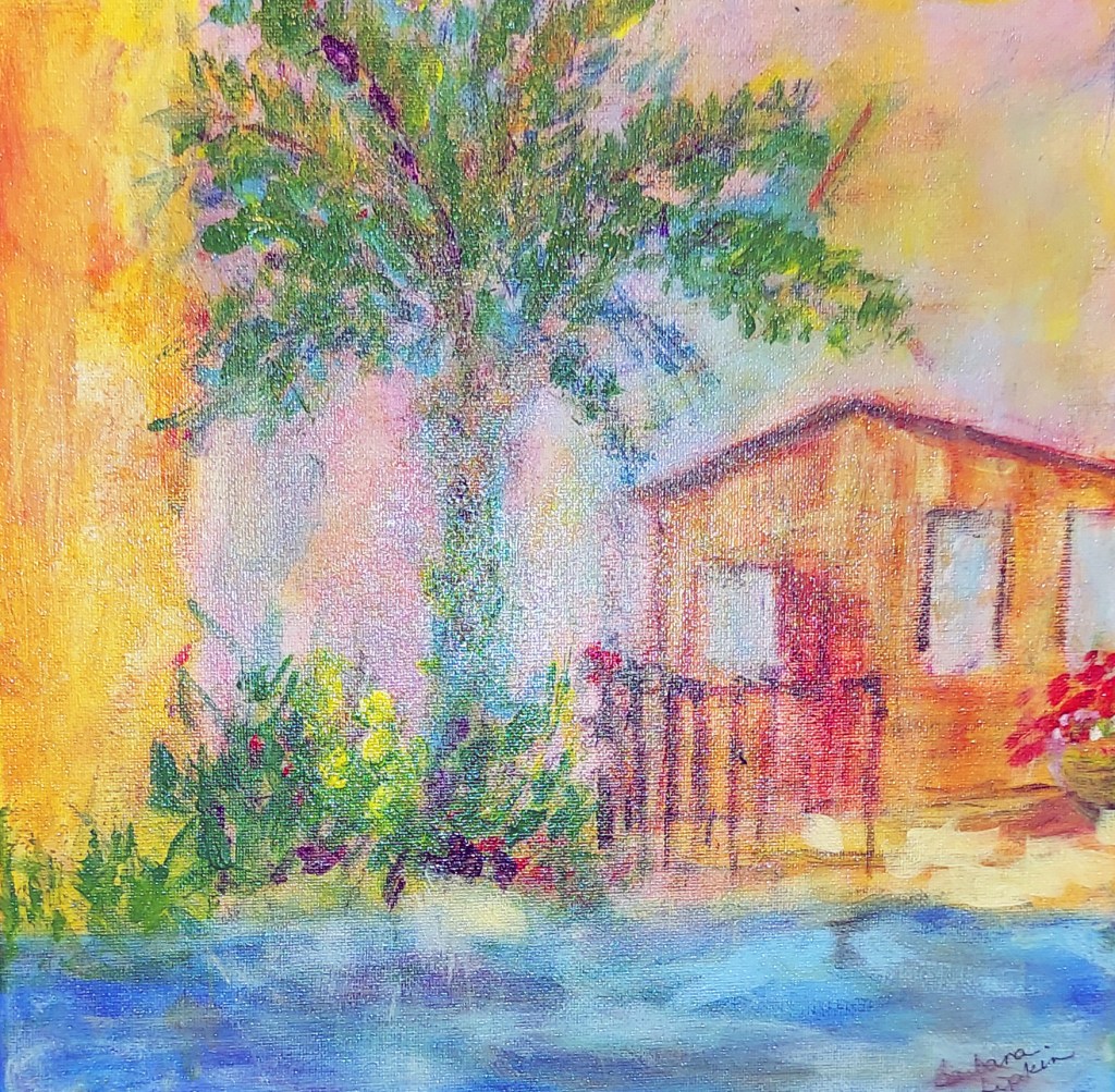
Winter is not my favorite season. The cold, the early dark–make me want to pull the covers over my head and stay in bed until Spring. But that way lies madness–right? So get up and paint, I tell myself. Remember the warmth and color of the sun. It’s still out there, even though it’s doing its best to hide from us right now. So I reminded myself of the Caribbean–the lush islands, the beach, the sea. And I got out my paints, squeezed out a pile of yellow, grabbed a brush, and started smearing paint on a couple of canvases. And guess what? Today, after a couple of weeks of intense cold, the sun did come out and the earth warmed up a bit. So I guess my ploy worked, for today, at least.
First, I did a little vignette.
Sand and Sea, acrylic, 12 x 12
Next, encouraged, I branched out into something a bit more substantial, focusing on the light, the sun filling the sky. So that’s how this landscape came by its name.
From earliest times, people have used pictures to tell a story. Following in this narrative tradition, I have created, over a period of years, a body of work that tells the stories of some of my earliest memories. Many of these paintings are hanging in our family room at this moment. Looking at them recently, I realized that I need to take the exhibit a step further.
Pictures are great, but to really tell a complete story, you need words. At least, I do. So I decided to add a ‘narrative’ to my ‘history paintings,’ so that subsequent generations will understand what I had in mind when I painted them.
I grew up in Chicago in the 1950’s and 60’s. My family was close, both in physical proximity and emotionally. My aunt and uncle, and my grandparents were always in each other’s apartments, celebrating holidays and family events, as well as taking many outings together within the city. They’re all gone now, but my memories of them are still vivid and alive.
Times change, and the lifestyle we enjoyed then is no longer possible, with families spread out all over the world. We don’t live in each other’s pockets anymore. So stories will have to take the place of experiences, and maybe my paintings can make my stories more vivid and real.
For example, Passover on 19th Street, shows a family at a Passover Seder. My father, grandfather, and uncle are reading from the Hagaddah, while my Grandma and aunt are working in the kitchen. My mom is next to my dad, putting a bowl of chicken soup with matzo balls on the table. The table is set with the traditional seder plate, wine and matzo, and the children are all at the table with the family. On the left side of the painting, a goat, (a kid-from the traditional song in the Hagaddah Chad Gadya – about one kid that father sold for two zuzim) peeks over the front door, and on the right side, there are the apartment houses that we lived in on Chicago’s West Side. There are a few extra guests at the Seder, which would have been normal. And the dining room isn’t what my grandma’s dining room looked like. But none of that is the point. What I hope viewers get from this painting is the sense of closeness and family celebrating a beloved holiday in a traditional way. I loved painting it.
I just spent 2 very happy Saturdays at the Scottsdale Artists’ School Portrait Open Studio. It’s been 7 years since I was a regular there, every Saturday morning, and it was fantastic to be back again. And…I learned a new technique. New to me, anyway.
I hadn’t brought any paints with me, only drawing materials, but I noticed that most of the others were doing “value paintings” using an oil palette of white, burnt sienna, and viridian. I’ve done plenty of value paintings, but never with viridian, so I couldn’t wait to get back to my own studio, break out the oil paints, and try it for myself. Today was the day!
I haven’t used oils in a while, but using them again today reminded me of why I love them and used them for so many years. They are so easy to play with, and they stay workable for hours, so there’s no rush. I can relax, take my time and enjoy the process. For my first effort at the new technique, I decided to copy one of the drawings I’d done at the Open Studio. I’m pretty happy with it, though still not sure if I like the viridian or not. I’ll work on it some more tomorrow, but here’s the ‘first draft.’
Monica, 12 x 9, oil and Monica, charcoal on paper, 14 x 11
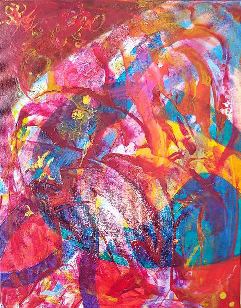
Sometimes my hands start itching, telling me I need to paint, but I don’t have any particular composition in mind. When that happens, I squeeze some paint on the palette and trust that the colors themselves will tell me what to do. I just ‘go with the flow’ and let the paint do its thing. After a while, an image begins to take shape. That’s when I can step in and gently nudge it in the right direction. The result? A kaleidoscope of color, sparkling on a beautiful fall day.
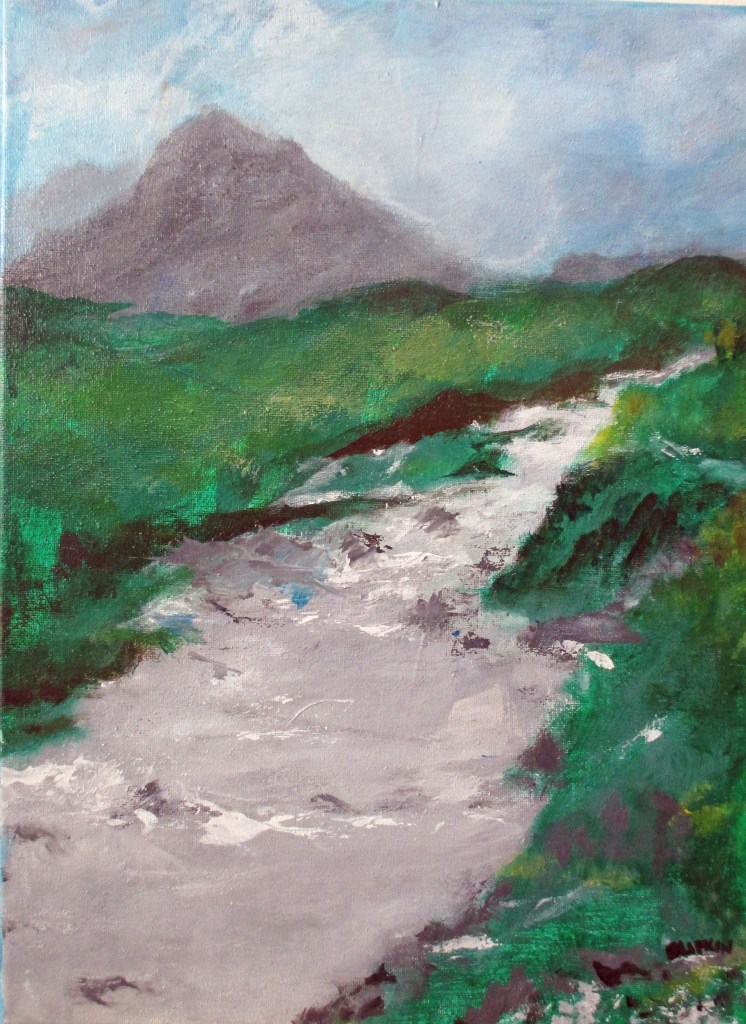
Artists are often advised to present a consistent body of work to the public, for very good reason. If you’ve developed a following, you owe it to your “fans” to give them what they expect. But as an artist, this is easier to say than to do. Creative people naturally want and need to experiment with various art forms, different media, interesting techniques. Even if you absolutely love abstractions, as I do, there’s nothing to stop you from also loving detailed landscapes and intricate still lifes.
When I exhibit, I make sure to maintain consistency. But in my own studio, anything goes. Here are two of my latest efforts, one completely abstract, with lots of texture and one in which I tried to capture the misty chill of a Scottish Highland stream.
Seas A-Rising, Acrylic, 20 x 16Scottish Highlands, Acrylic, 16 x 12
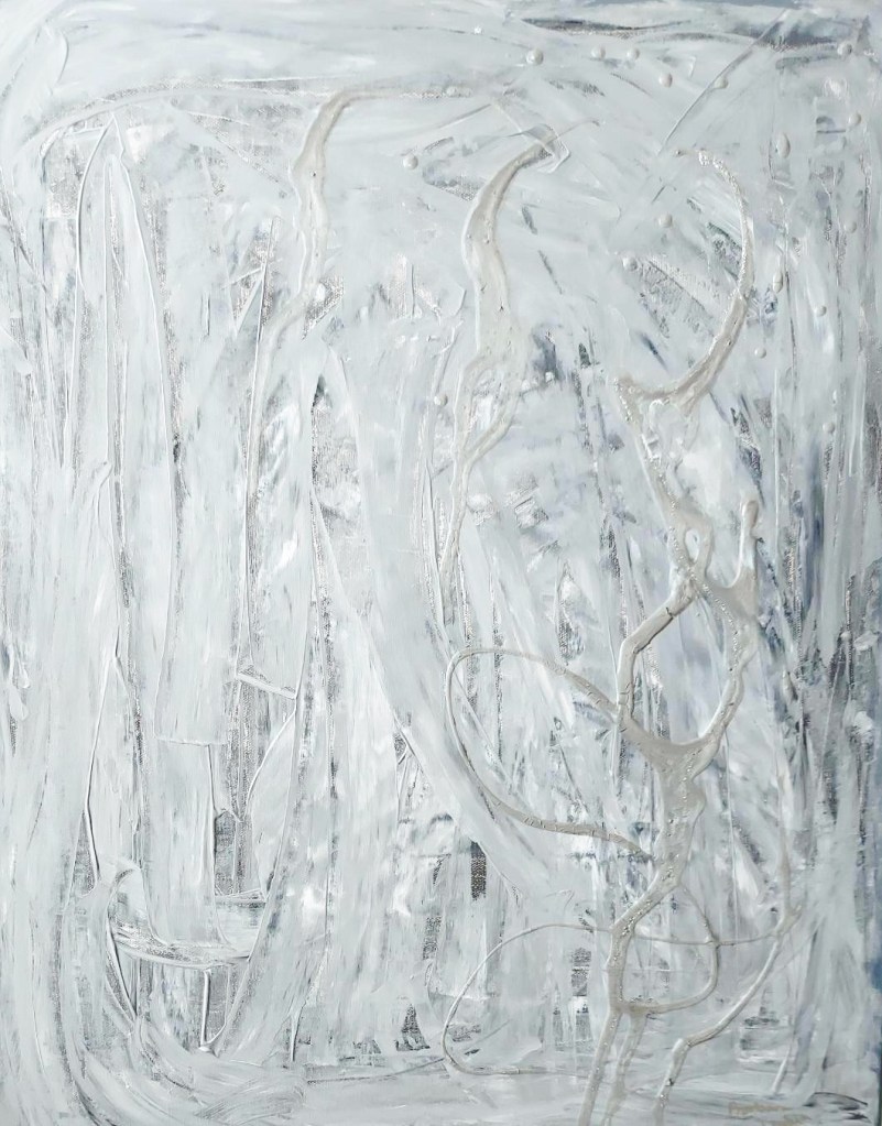
Maybe you’ve noticed–I love color. I love how different colors play off each other, sometimes soft and soothing (analogous colors), sometimes bright and jarring (complimentary colors). I often combine my colors with various mediums to create texture on the canvas, too. But for “Sculpture in Gray,” I decided to try something different. To begin, I just glopped on a pile of black and white paint loosely mixed with fiber paste and started spreading it around with a large palette knife. The painting sort of took off on its own from there. I glopped on more paint, dribbled on some silver, sprinkled a little glitter and–voila!
At first glance, you might think it’s just a gray painting, but as you look at it, you notice the swirls and layers, the shadows and lights, and you begin to lose yourself in the richness of the painting. I’ve been studying it in my studio for about a month now, wondering if I need to add any of my signature colors or maybe some defined shapes. But I’ve decided I love it just the way it is. Minimalism has certainly been around since at least mid-twentieth century, but now I find myself appreciating it much more deeply than I ever have before.
Sometimes people ask me how I come up with my titles. Well, I enjoy naming my pieces almost as much as I do creating them in the first place. I try to invent names that give the viewer a hint of what I was thinking while I was painting, but at the same time, something that leaves a bit of mystery, a little question in their minds. I’m calling this piece Gothic Bazaar. Why? Well, the pointed arch is a bit of Gothic architecture, isn’t it? And the colors remind me of the time I visited the bazaar in Istanbul, full of golds and secret passageways and hidden corners. Touristy? Sure, but all the same exotic and fun. Everything about this–the design, the colors, and yes – even the title, says Whimsy. A bit of whimsy to brighten up a cold winter day.
Paint on canvas-what could be more peaceful and calming than the simple act of applying paint to canvas? Letting the paint flow while music supplies the mood and and directs the action. Enjoying the colors, savoring the process of letting the design happen. Nothing better on a January day.
Here are two of my latest efforts.
Melody, Mixed Media, 14 x 11
Feel free to contact me for prices and delivery information.